Ever opened a report, scrolled for a few seconds, and thought: “Where do I even start?”
If you run a small or midsize business, chances are you’ve been there. Sales numbers are buried under marketing analytics, operations stats, and a dozen other metrics you didn’t even ask for. It’s all “important,” but somewhere between downloading the report and making a decision, your brain taps out.
You’re not alone. Research shows the average person processes around 74 gigabytes of information a day—basically like watching 16 movies back-to-back. No wonder it’s hard to focus on what really matters.
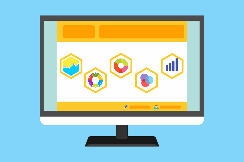
So how do you cut through the noise without ignoring the numbers entirely? For a lot of SMBs, the answer is surprisingly simple: visualize it.
The Challenge of Data Overload
Data overload happens when you’ve got more information than you can process in time to make good decisions. In a small business, that flood comes from everywhere—point-of-sale systems, CRMs, website analytics, social media, accounting, industry reports, and more.
The result?
- Decisions get delayed because you can’t separate the signal from the noise.
- Opportunities and risks slip by because patterns aren’t obvious.
- Teams duplicate work by building reports in silos.
And here’s the kicker: without the budget for a full analytics team, many SMBs either avoid analysis altogether or rely on basic tools that don’t tell the whole story. Even with good software, someone still has to know how to use it.
If you can’t see clearly what’s happening in your business, how can you make confident moves?
Using Data Visualization to Cut Through the Noise
Visualization doesn’t magically fix messy inputs, but it does make data easier to process. Humans are wired to spot patterns, colours, and shapes faster than reading rows of numbers.
Think of the last time you saw a line chart of sales climbing month after month—you understood the trend in two seconds. Try doing that with 300 rows of raw transaction data.
Why Visualization Works for SMBs
Speed matters when you’re running a small business. You don’t have time for week-long data deep dives. Visualization helps because:
- Patterns jump out: Seasonal swings, sudden drops, or outliers are instantly visible.
- Decisions get faster: Leaders can focus on key indicators without wading through fluff.
- Everyone’s aligned: A chart communicates across roles—IT Support, marketing, or front-of-house.
- Memory sticks: People remember visuals better than text-heavy reports.
Visualization isn’t just for execs. A store manager tracking inventory turnover or a marketing assistant watching engagement rates benefits just as much.
Best Practices for Simple, Impactful Visuals
We’ve all sat through meetings where a chart looked like modern art—interesting, but useless. A good visual should feel effortless. Here’s how:
- Start With Your Audience
Executives want high-level clarity; a marketing intern might need granular detail. Match the visual to the viewer. - Match the Chart to the Story
- Compare regions? Bar chart.
- Track churn over 12 months? Line chart.
- Spot busy times? Heatmap.
Pie charts? Use sparingly (and only if the slices are visible).
- Keep the Clutter Out
If it doesn’t help someone “get it” faster, strip it out—extra gridlines, overdone backgrounds, or colour explosions. - Use Colour Wisely
One bold highlight beats a rainbow. Colour should guide the eye, not overwhelm it. - Let People Explore
Dashboards with filters let users zoom in on the data they care about without chasing you for more reports.
Affordable Tools and Tactics for SMBs
You don’t need an enterprise budget for good visuals. Some budget-friendly options include:
- Google Data Studio: Free and integrates with popular platforms.
- Zoho Analytics: Built for SMBs, with simple dashboards.
- Tableau Public: Great for storytelling (note: it’s public-facing).
- Excel Power Query & Power Pivot: Automates data prep in a familiar tool.
- Infogram: Quick infographics and clean reports.
Pair tools with automation—scheduled imports, data-cleaning scripts—and suddenly your reports go from clunky to actionable.
Turn Your Data Into Action
Data overload isn’t going anywhere. In fact, you’ll probably have even more of it next year. But with the right approach, it doesn’t have to mean confusion.
Visualization helps you:
- Spot what matters at a glance.
- Make faster, smarter decisions.
- Align teams without endless explanations.
Start small. Pick one metric—maybe monthly recurring revenue or weekly foot traffic—and visualize it cleanly. Build from there. You’ll be surprised how quickly your team shifts from staring at numbers to acting on insights.
And if spreadsheets are starting to feel like they’re staring back at you? That’s where we can help. With Managed IT and data-focused IT Support, we’ll strip away the noise, highlight what counts, and make your numbers speak volumes.
Ready to stop drowning in data and start using it? Contact us today—we’ll make clarity your new normal.
—